HTML Images
Adding visual content to web pages
🖼️ What are HTML Images?
HTML images are visual elements that enhance web pages. They are embedded using the <img> tag, which is a self-closing tag that doesn't require a closing tag.
<!-- Basic image example -->
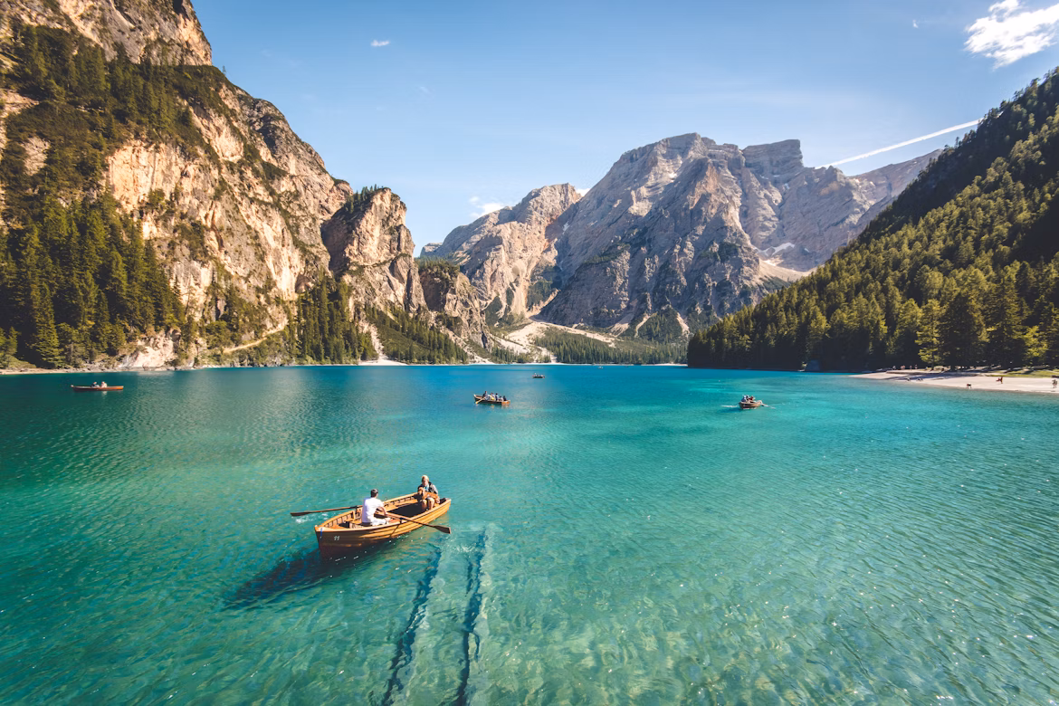
<img src="demo.png" alt="A beautiful landscape">
<img src="css.svg" alt="css logo" width="200">
Output:

Essential Image Attributes
src (Source)
Specifies the image file path
<img src="images/photo.jpg">alt (Alternative)
Describes image for accessibility
<img alt="Sunset over mountains">width & height
Controls image dimensions
<img width="300" height="200">title
Shows tooltip on hover
<img title="Click to enlarge">🔹 Basic Image Syntax
The <img> tag requires the src attribute and should always include alt text:
<!-- Required attributes -->
<img src="path/to/image.jpg" alt="Description of image">

<!-- Complete example -->
<img src="sunset.jpg"
     alt="Beautiful sunset over the ocean"
     style="width: 300px;
     height: 200px;
     border-radius: 8px;">
Output:
🔹 Image File Formats
Different image formats serve different purposes:
Common Image Formats:
- JPEG (.jpg, .jpeg): Best for photos with many colors
- PNG (.png): Best for images with transparency
- GIF (.gif): Best for simple animations
- SVG (.svg): Best for scalable graphics and icons
- WebP (.webp): Modern format with better compression
<!-- Different image formats -->
<img src="photo.jpg" alt="JPEG photo">
<img src="logo.png" alt="PNG logo with transparency">
<img src="animation.gif" alt="Animated GIF">
<img src="icon.svg" alt="Scalable vector icon">
🔹 Responsive Images
Make images adapt to different screen sizes:
🔸 CSS Responsive Images
<!-- Responsive with CSS -->
<img src="large-image.jpg"
     alt="Responsive image"
     style="max-width: 100%; height: auto;">

<!-- Using CSS class -->
<style>
.responsive-img {
    max-width: 100%;
    height: auto;
}
</style>
<img src="image.jpg" alt="Responsive" class="responsive-img">
🔸 HTML Responsive Images
<!-- Different images for different screen sizes -->
<picture>
    <source media="(max-width: 600px)" srcset="small-image.jpg">
    <source media="(max-width: 1200px)" srcset="medium-image.jpg">
    <img src="large-image.jpg" alt="Responsive image">
</picture>
🔹 Image Alignment and Styling
Control how images appear on your page:
<!-- Center aligned image -->
<div style="text-align: center;">
    <img src="centered.jpg" alt="Centered image">
</div>

<!-- Floating images -->
<img src="left.jpg" alt="Left aligned" style="float: left; margin-right: 10px;">
<img src="right.jpg" alt="Right aligned" style="float: right; margin-left: 10px;">

<!-- Styled images -->
<img src="styled.jpg" alt="Styled image"
     style="border: 3px solid #333; border-radius: 10px; box-shadow: 0 4px 8px rgba(0,0,0,0.3);">
Output:
🔹 Image as Links
Images can be clickable links:
<!-- Image link -->
<a href="gallery.html">
    <img src="thumbnail.jpg" alt="View Gallery" width="200">
</a>

<!-- Image link with styling -->
<a href="product.html" style="text-decoration: none;">
    <img src="product.jpg" alt="Buy Now"
         style="border: 2px solid transparent; transition: border 0.3s;"
         onmouseover="this.style.border='2px solid blue'"
         onmouseout="this.style.border='2px solid transparent'">
</a>
Output:
🔹 Image Maps
Create clickable areas within a single image:
<!-- Image with clickable areas -->
<img src="../../../assets/img/demo1.png" alt="Interactive map" usemap="#imagemap" width="400" height="300">

<map name="imagemap">
    <area shape="rect" coords="0,0,100,100" href="section1.html" alt="Section 1">
    <area shape="circle" coords="200,150,50" href="section2.html" alt="Section 2">
    <area shape="poly" coords="300,100,400,150,350,200" href="section3.html" alt="Section 3">
</map>
Output: